Redefining WPP’s identity
Brand identity
2023
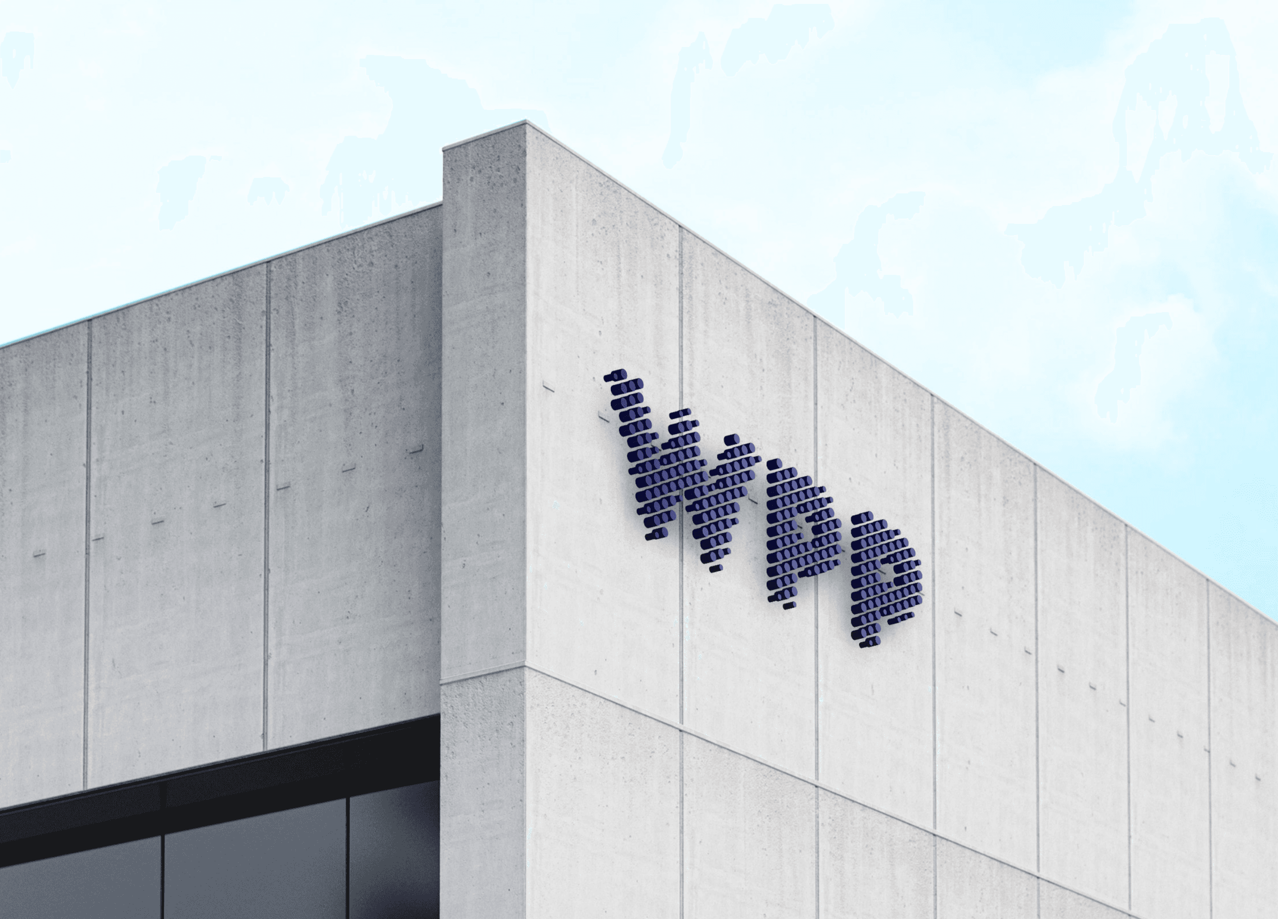
As the lead designer at WPP HQ, I guided the transformation of WPP’s brand identity into a cohesive and inspiring system that speaks to our values of creativity, transformation and collaboration.
Working alongside Landor in the initial rebranding phase, who provided the foundational brand direction, I took the lead on refining and extending this vision, creating an adaptable, global brand identity that empowers every team to represent WPP consistently and effectively.
Inspiration behind the brand
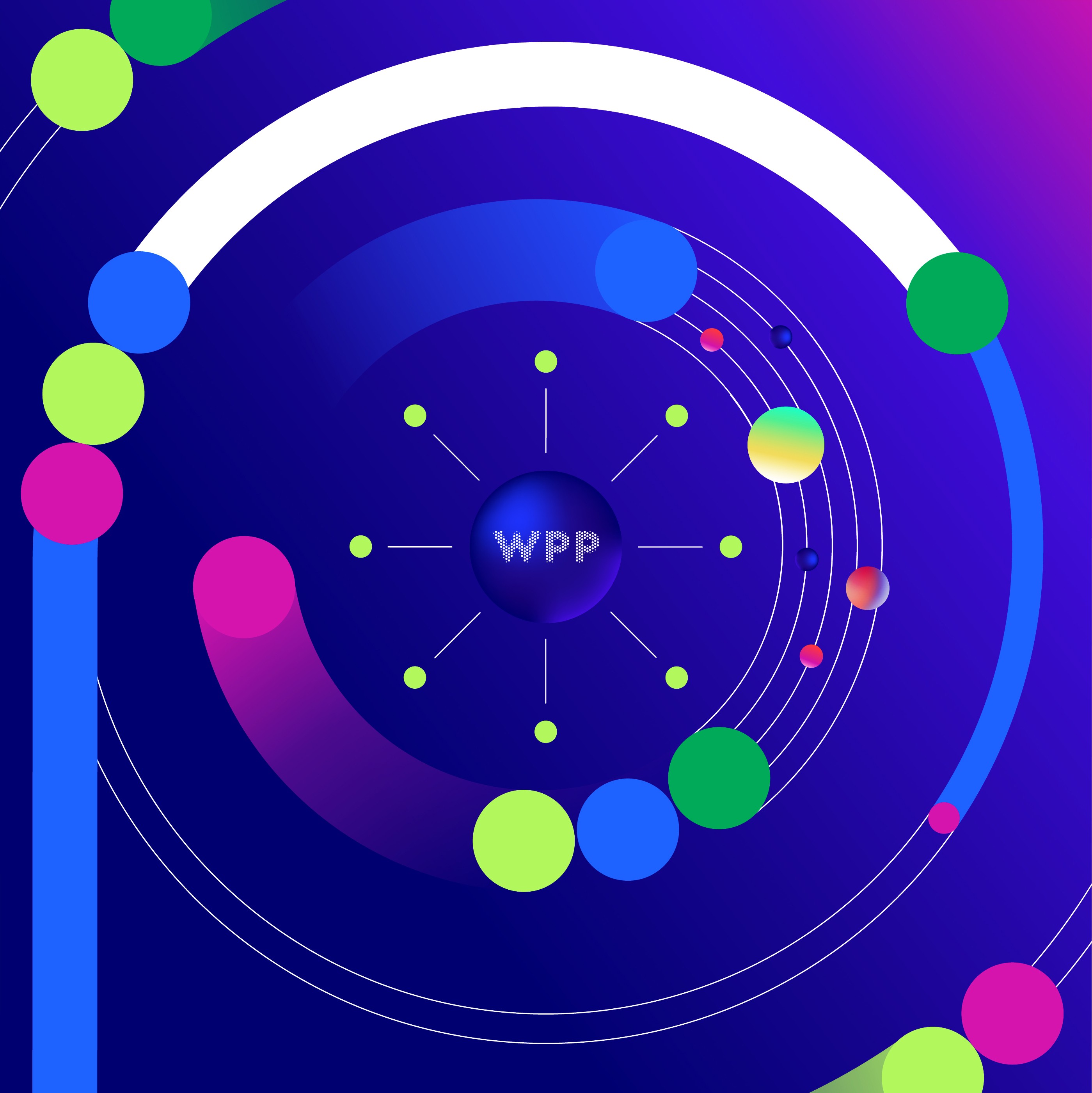
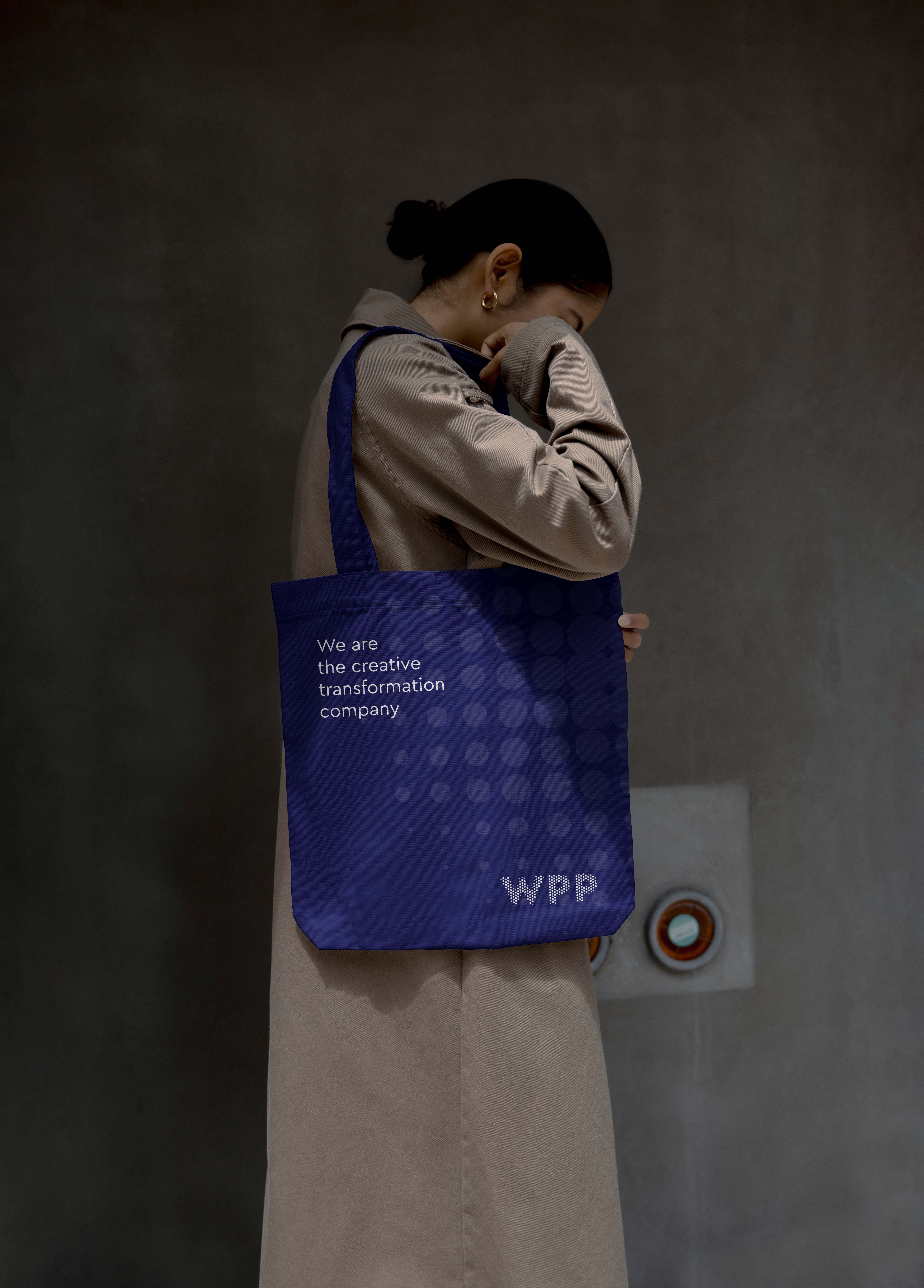
The circle in WPP’s logo—a timeless symbol of unity, creativity, and collaboration—served as the foundation for the refreshed brand system.
The vibrant colour spectrum and circular forms convey movement, innovation and diversity, reflecting WPP’s role as a connector of people, ideas and industries globally.
Our brand elements
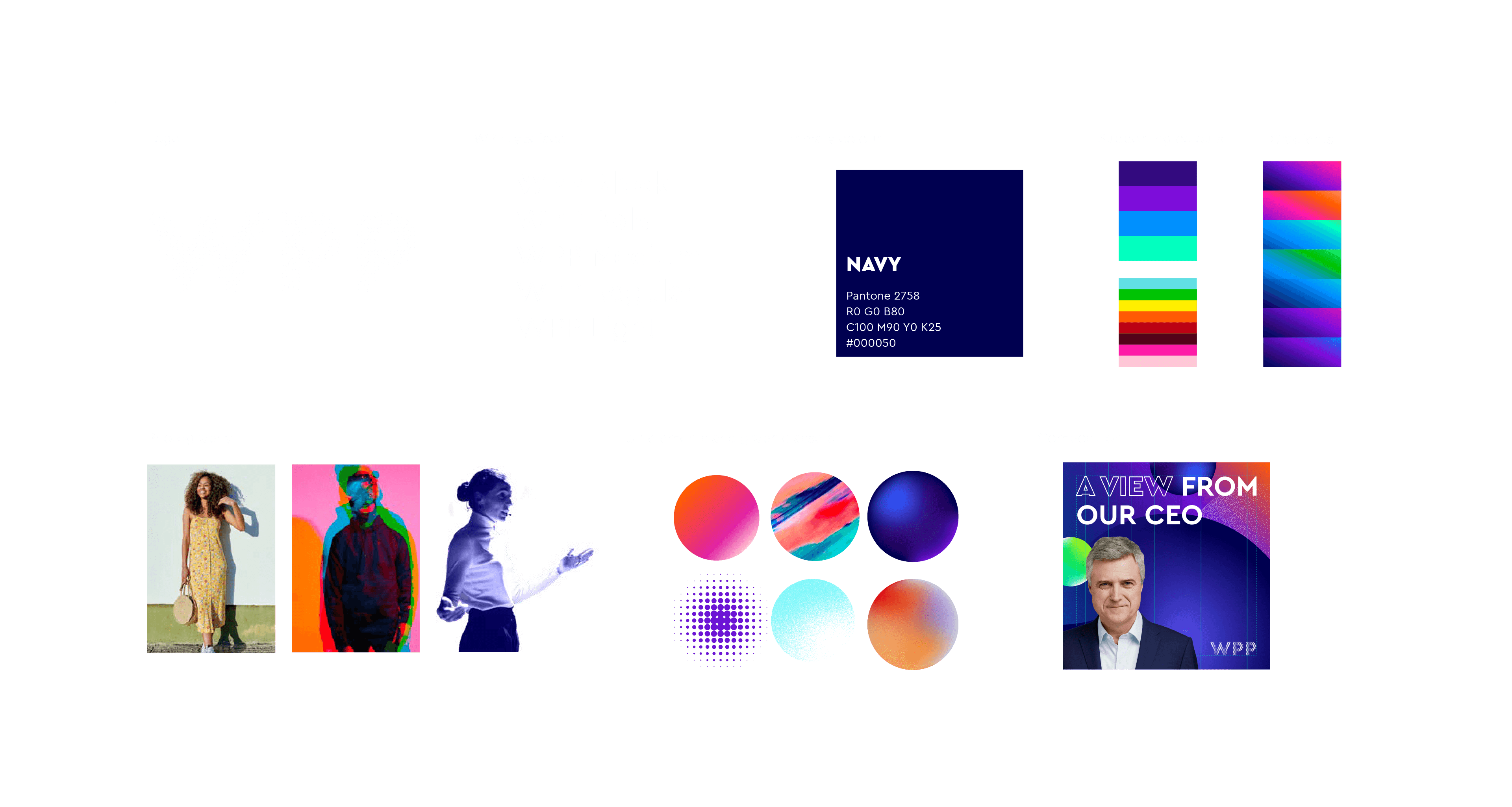
The WPP identity is built on a modular system designed for versatility, allowing teams to adapt the brand across diverse applications while maintaining its integrity.
Key elements of WPP’s brand identity, designed to ensure the brand feels unified yet adaptable across global markets and cultural contexts.
Extending the brand
To bring WPP’s brand identity to life across digital touchpoints, I developed a suite of assets and systems tailored to modern workflows.
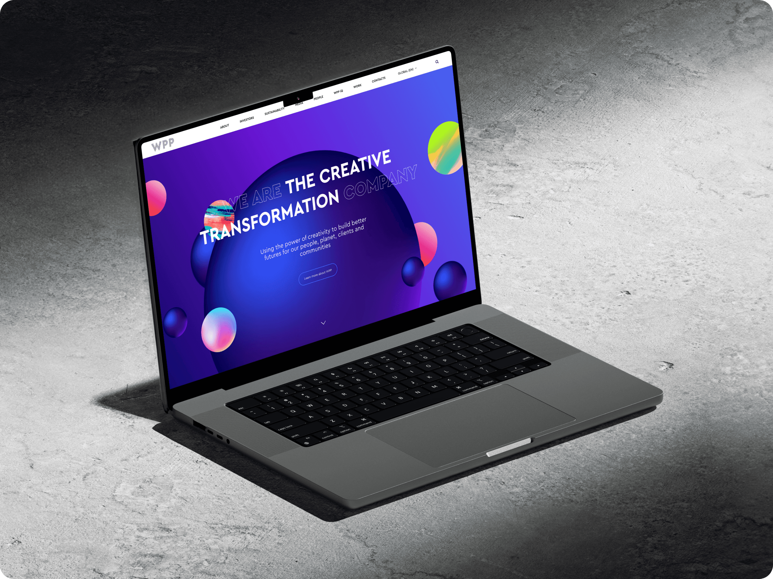
Corporate website redesign: brought the brand’s identity to life online, combining bold aesthetics with accessibility and dynamic storytelling to engage global audiences.
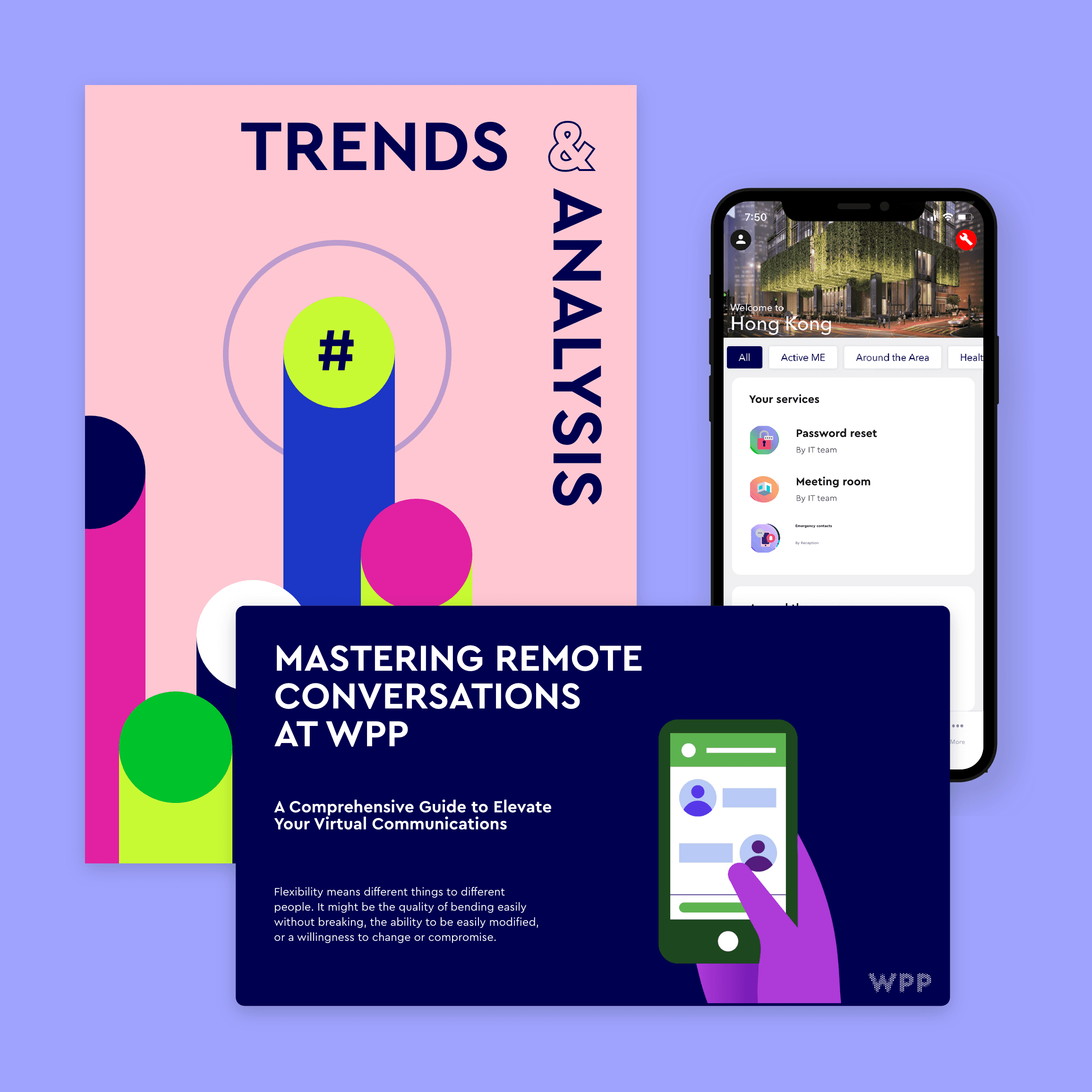
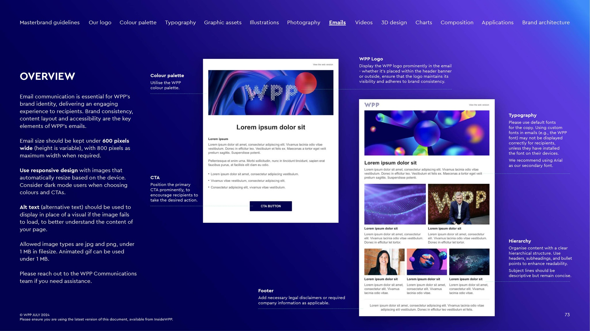
Emails: I've designed modular email templates with a focus on responsive layouts, accessibility and clear visual hierarchy, maintaining brand consistency while empowering global teams to deliver seamless communications.
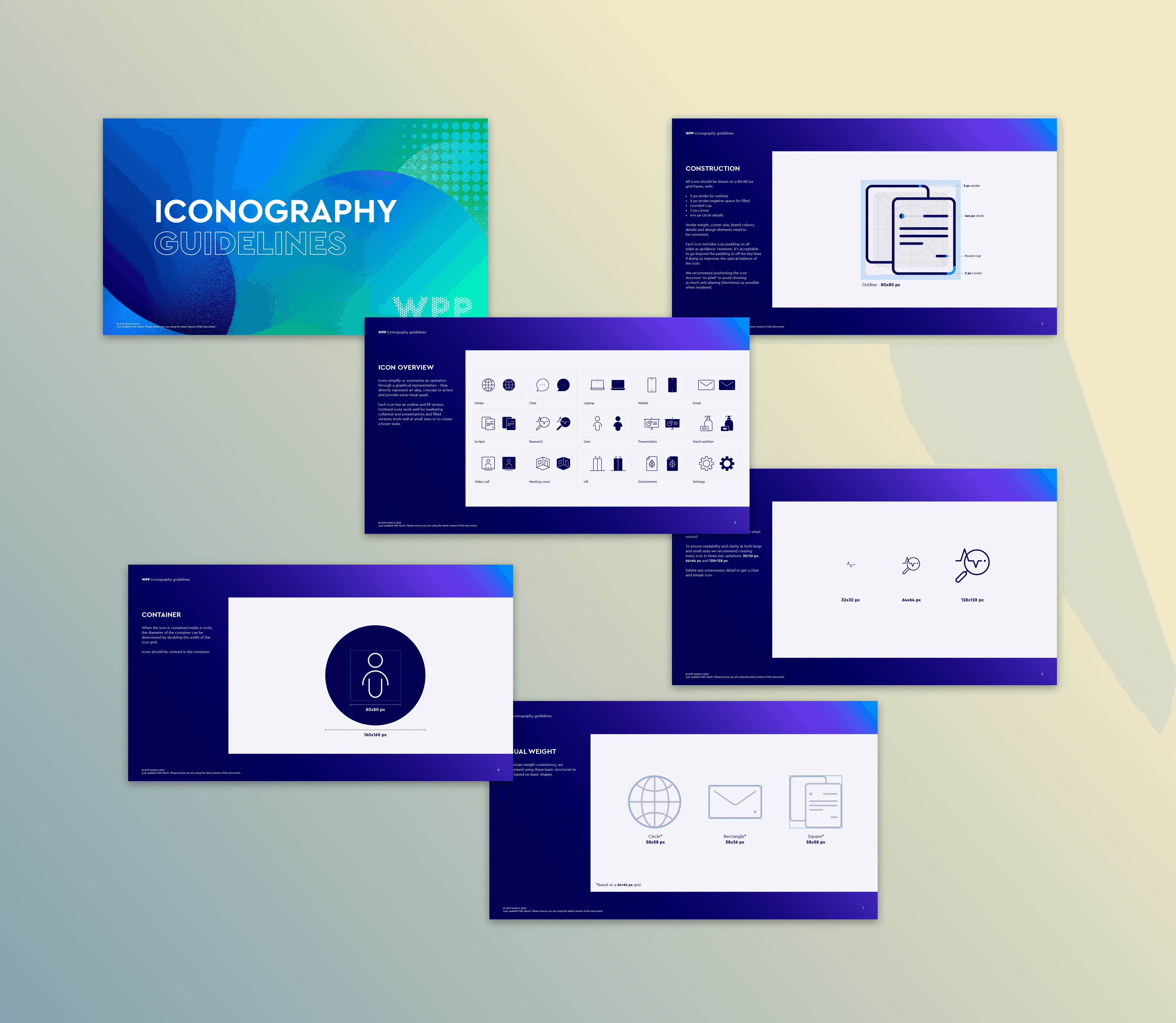
Iconography: designed for scalability across digital, print and environmental touchpoints.
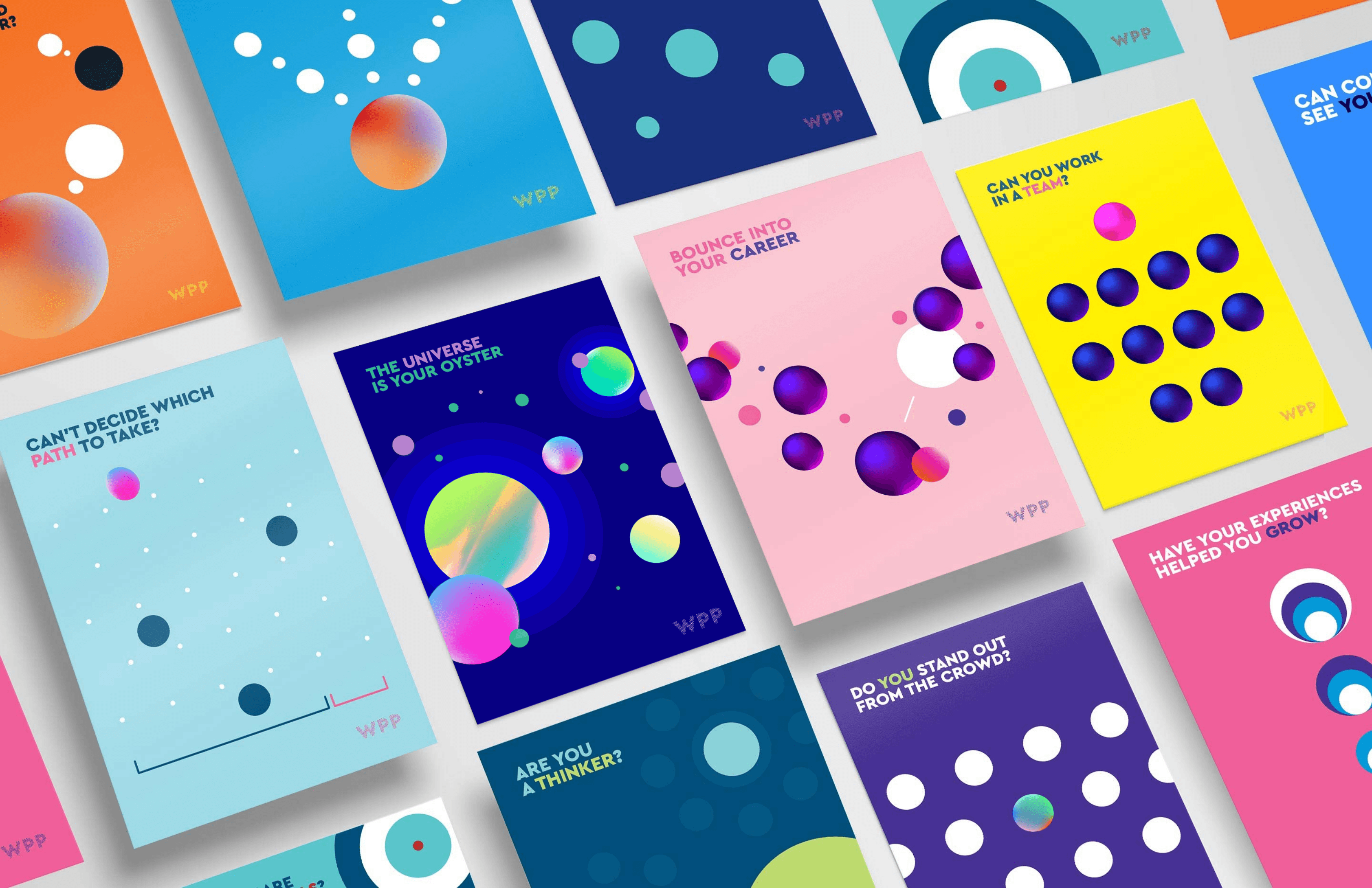
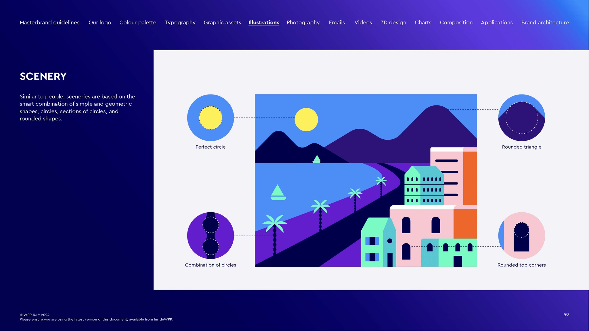
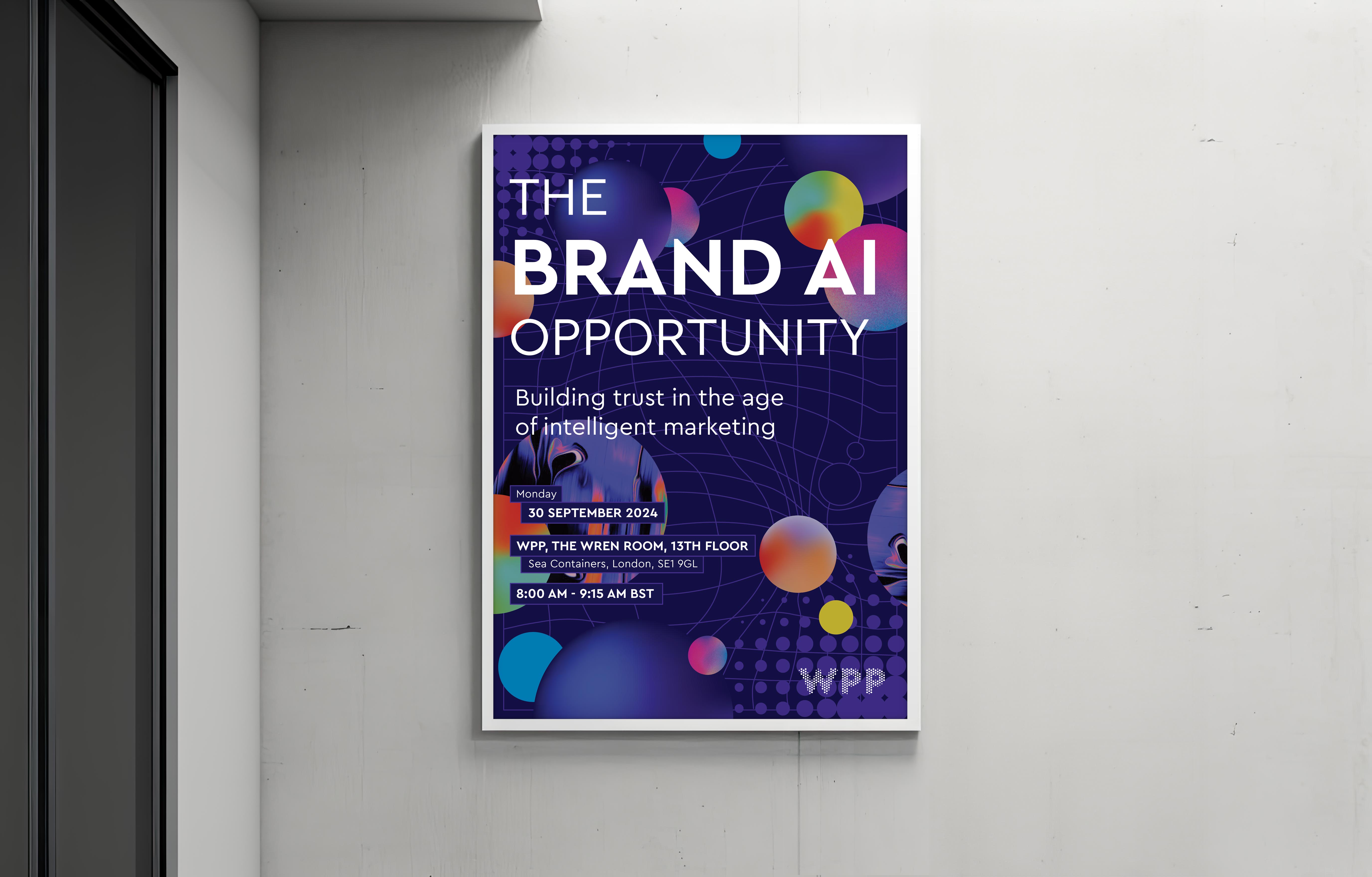
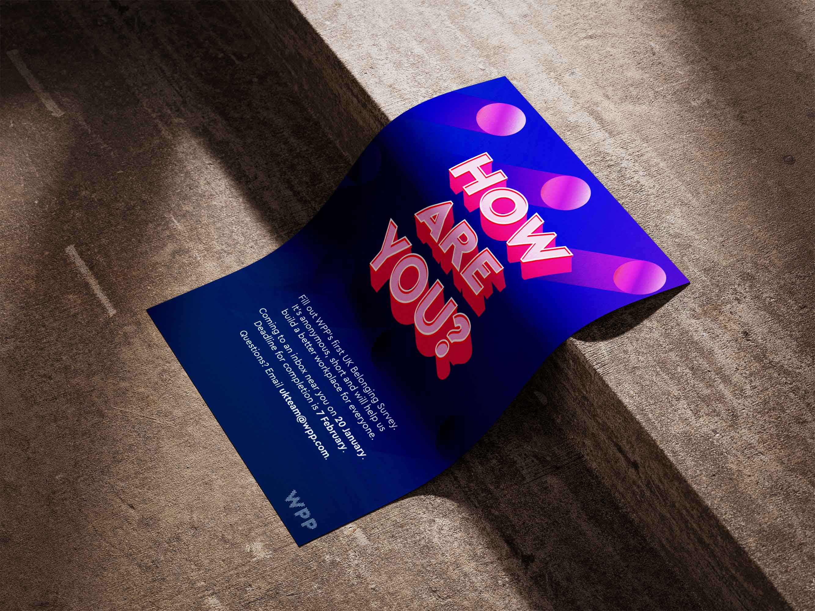
Illustration system: a flexible dual-style illustration system blending abstract and narrative visuals. Geometric shapes convey innovation and inclusivity, creating adaptable assets that enrich WPP’s storytelling across print and digital platforms.
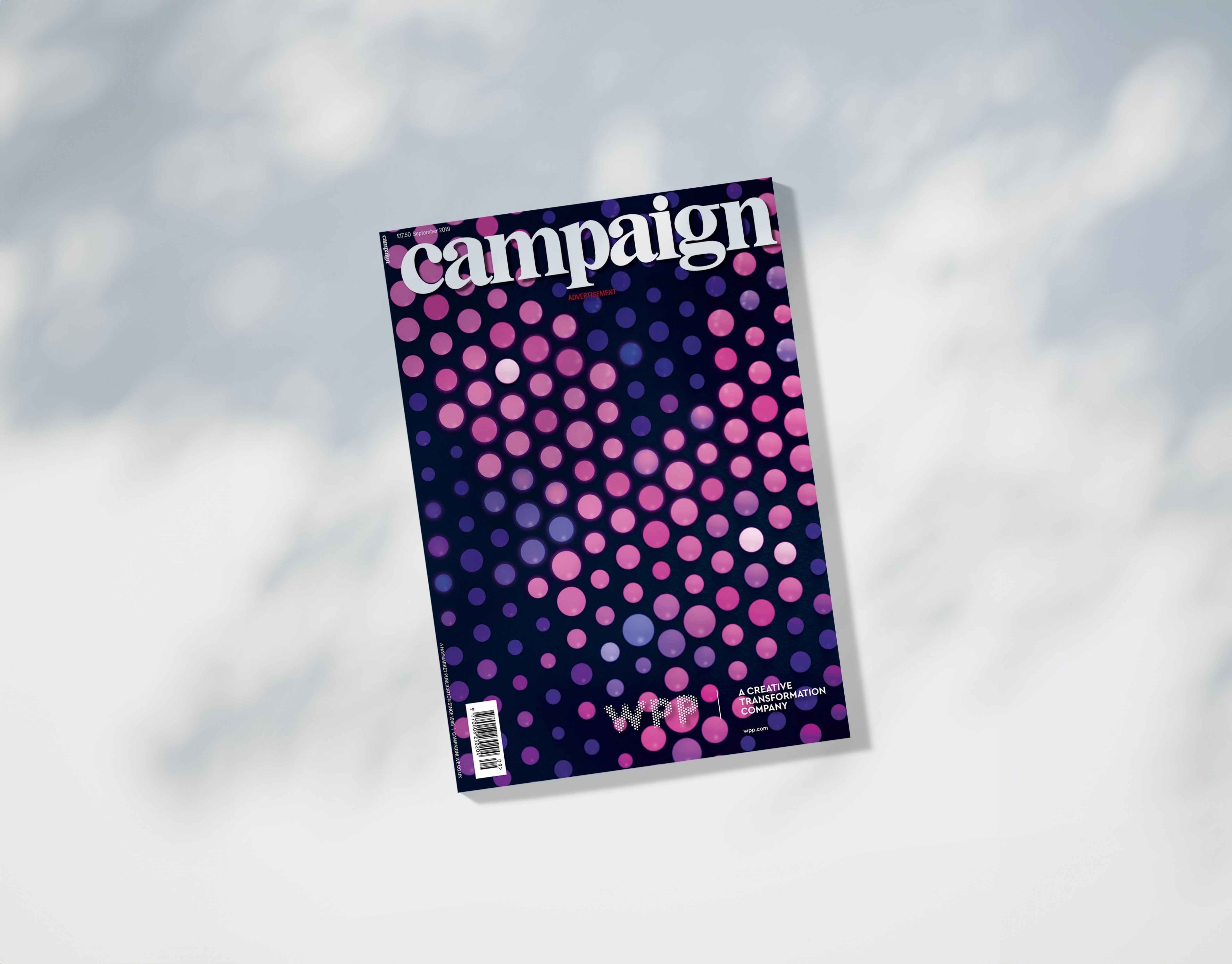
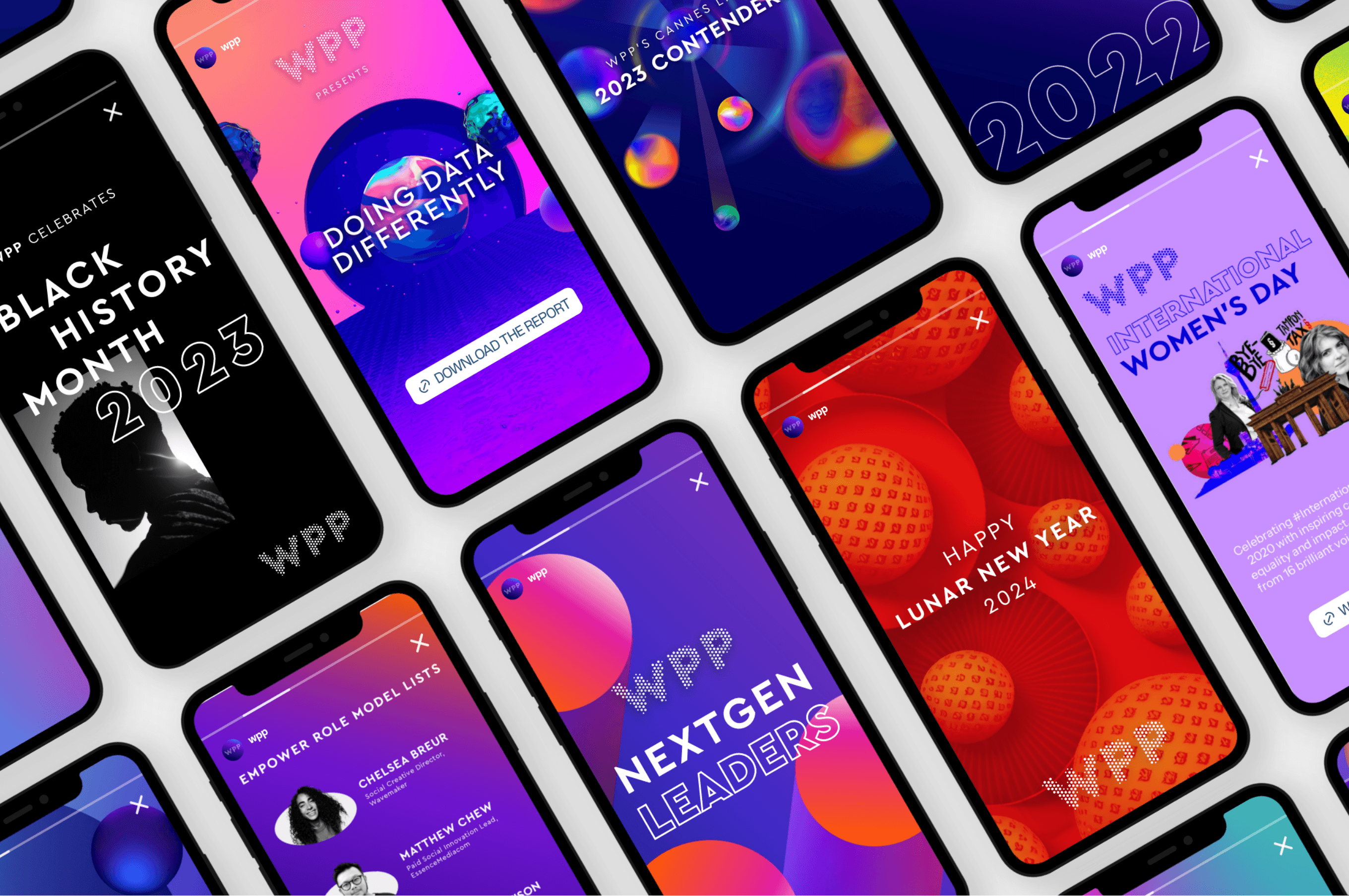
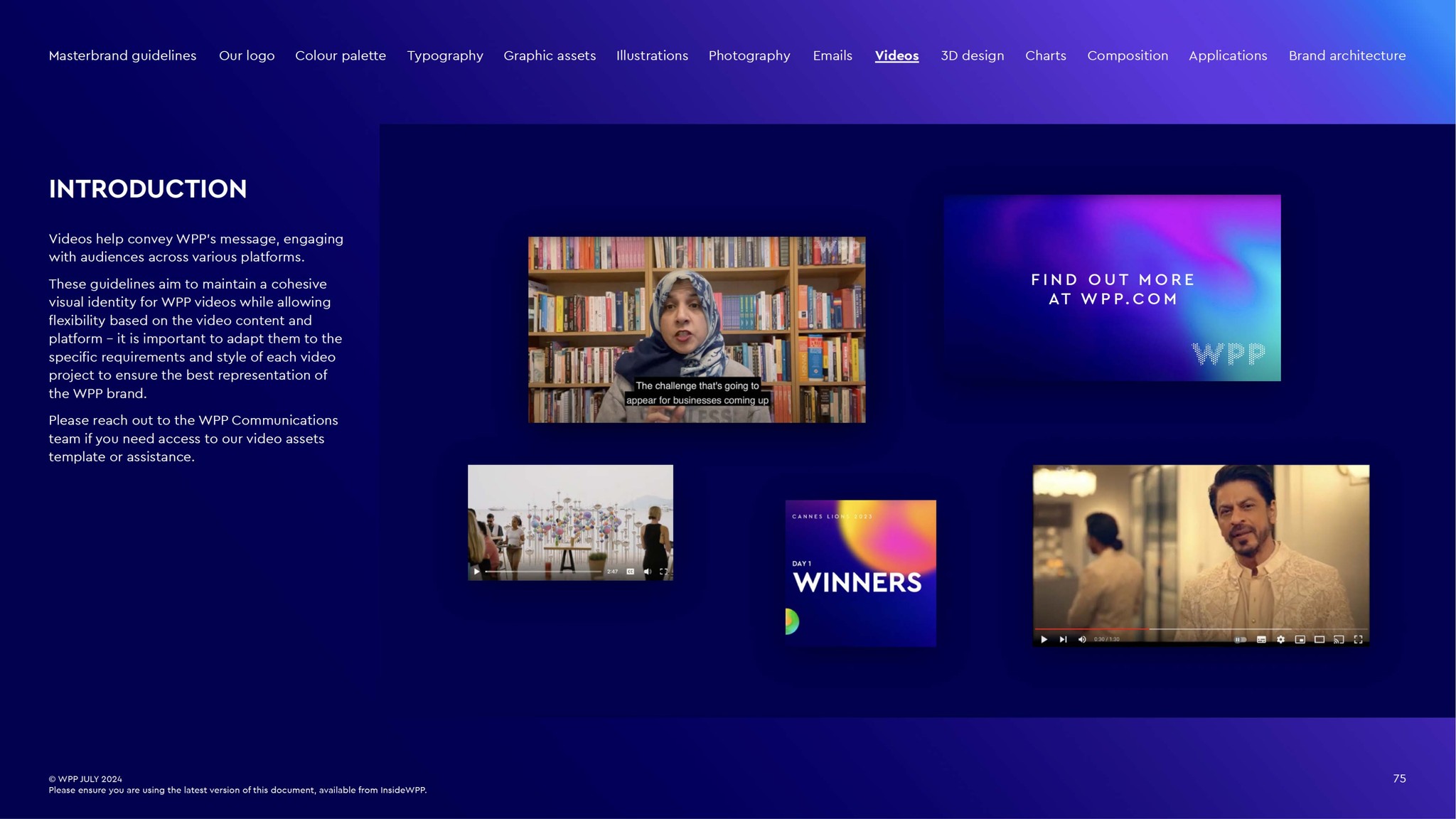
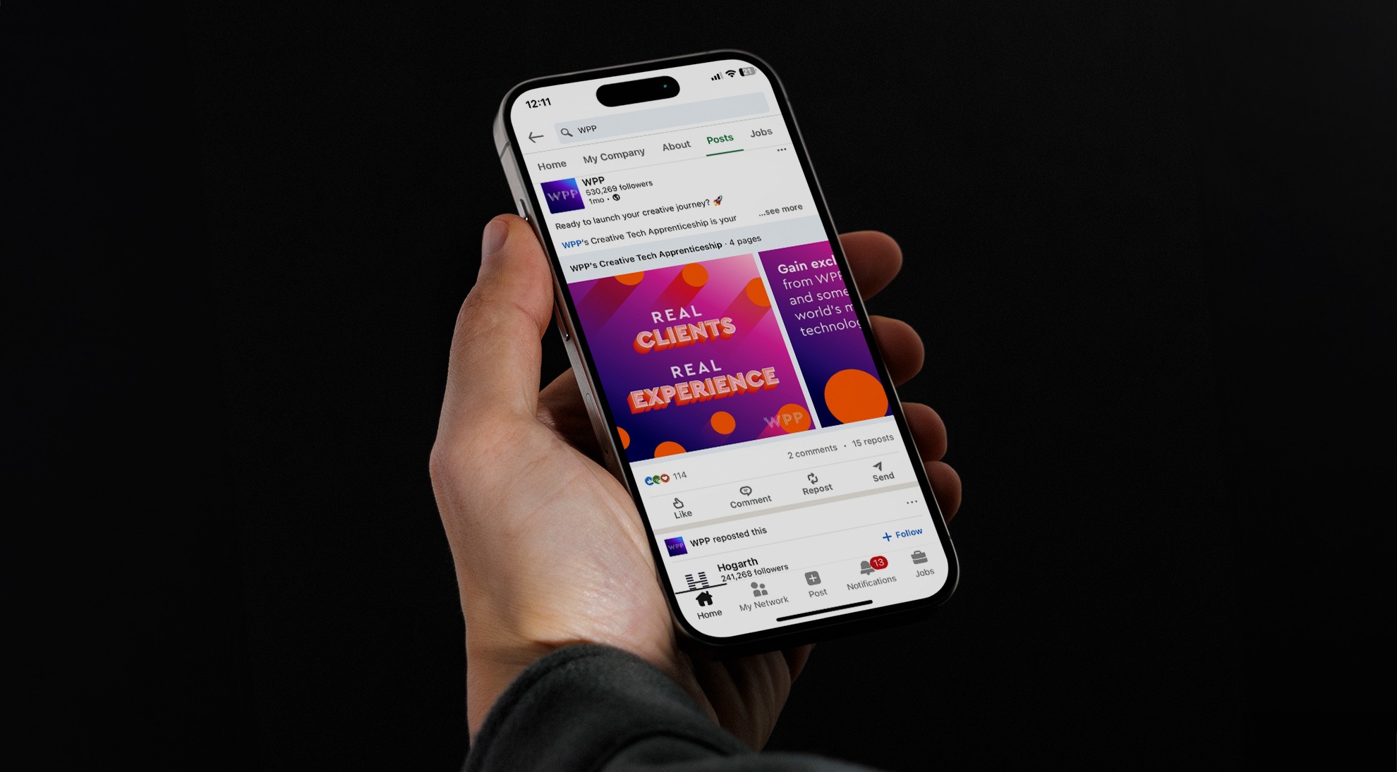
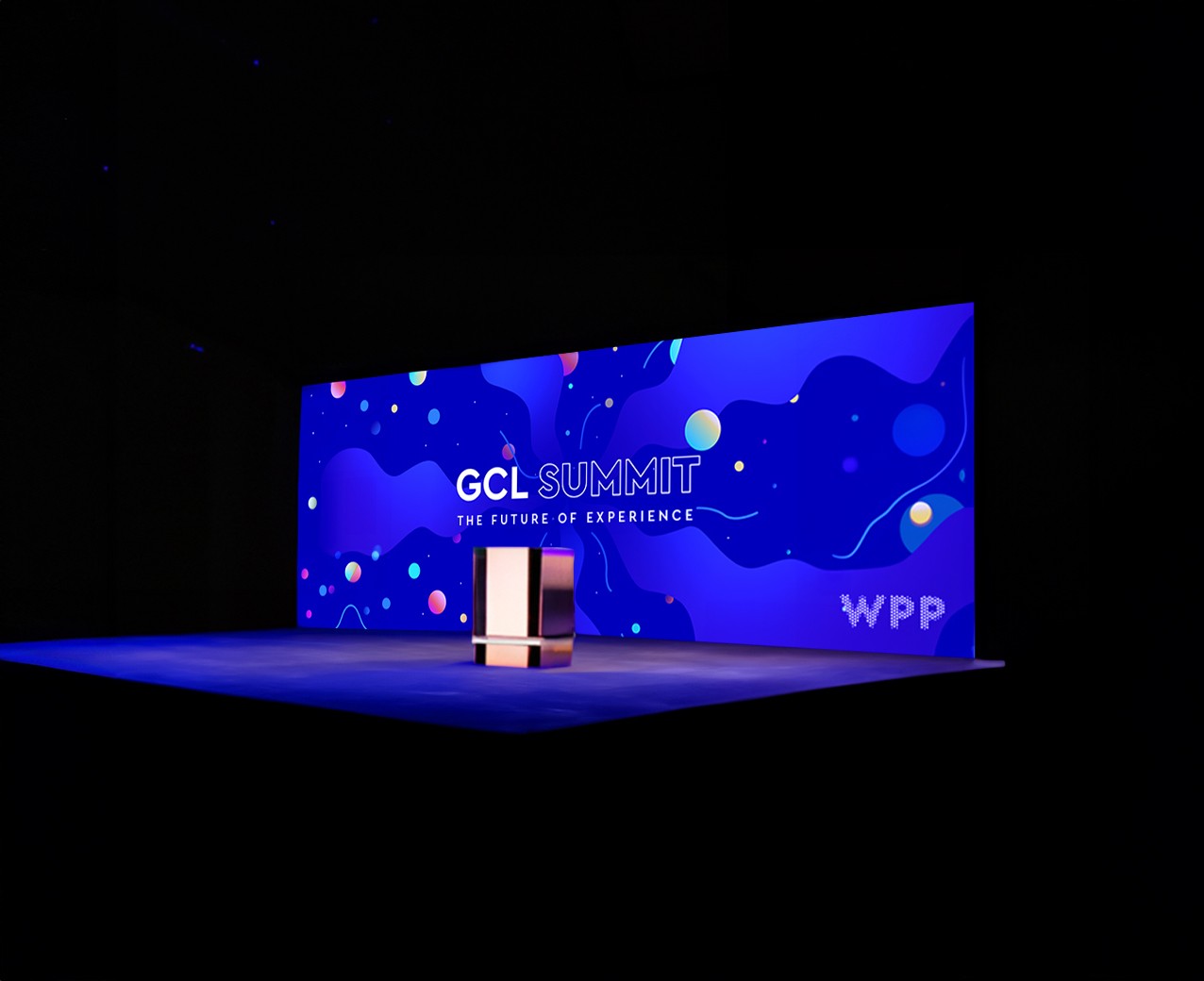
Digital collaterals and social media: a range of dynamic templates and visuals were designed for campaigns, motion graphics and social media. These assets ensured a cohesive brand presence while engaging diverse audiences across platforms.
Brand guidelines
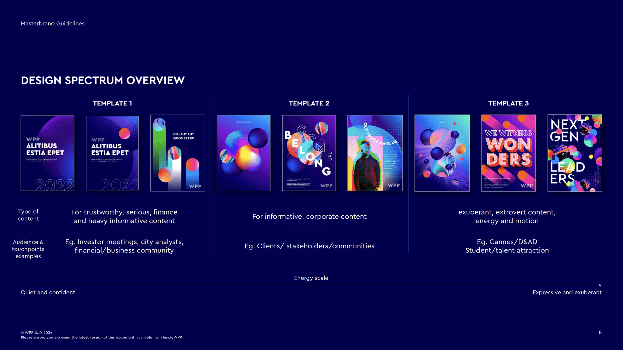
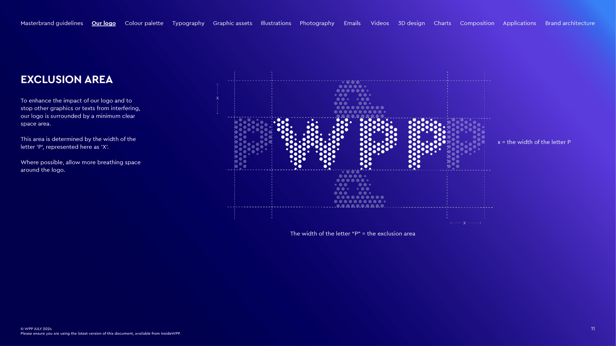
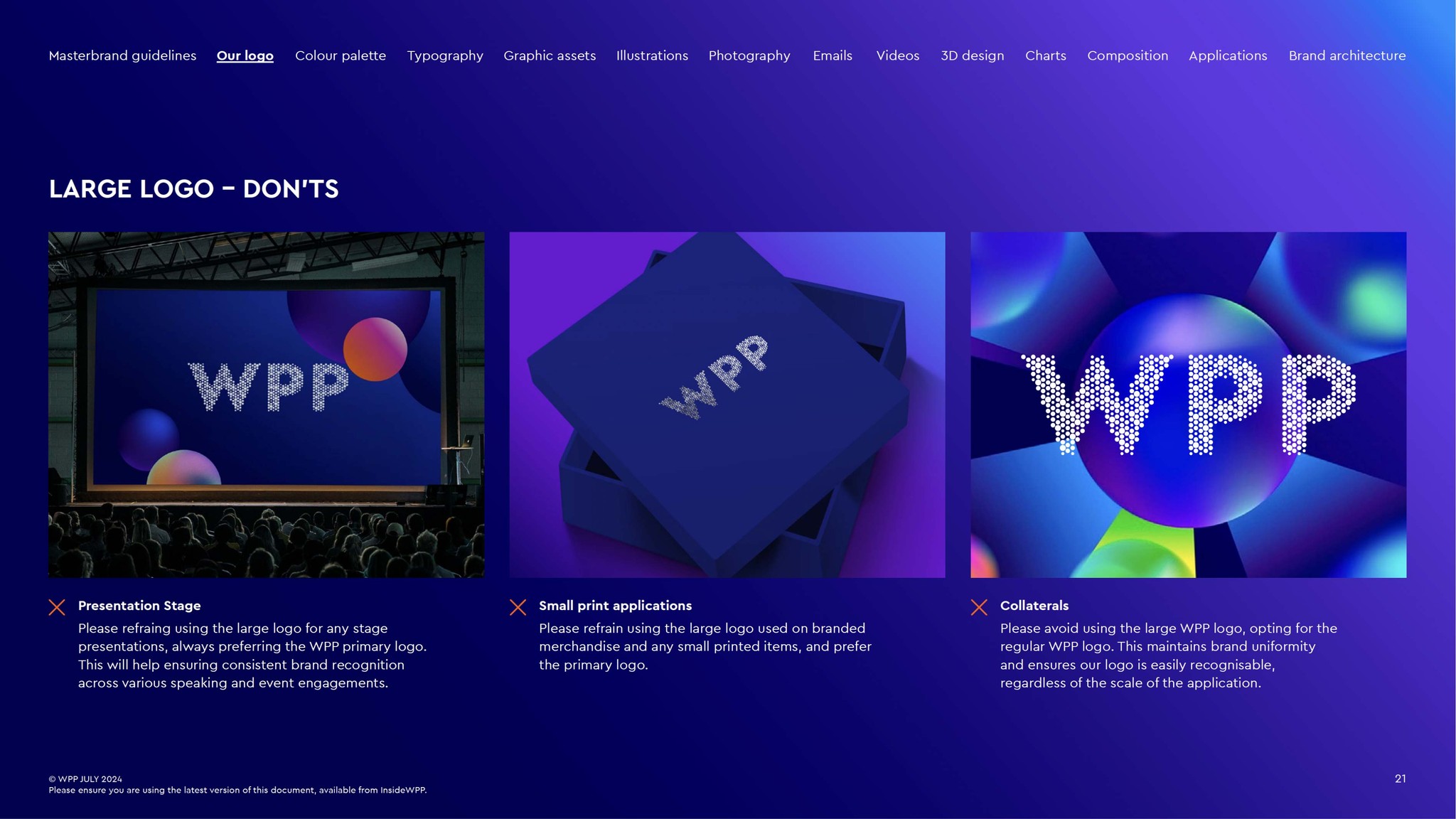
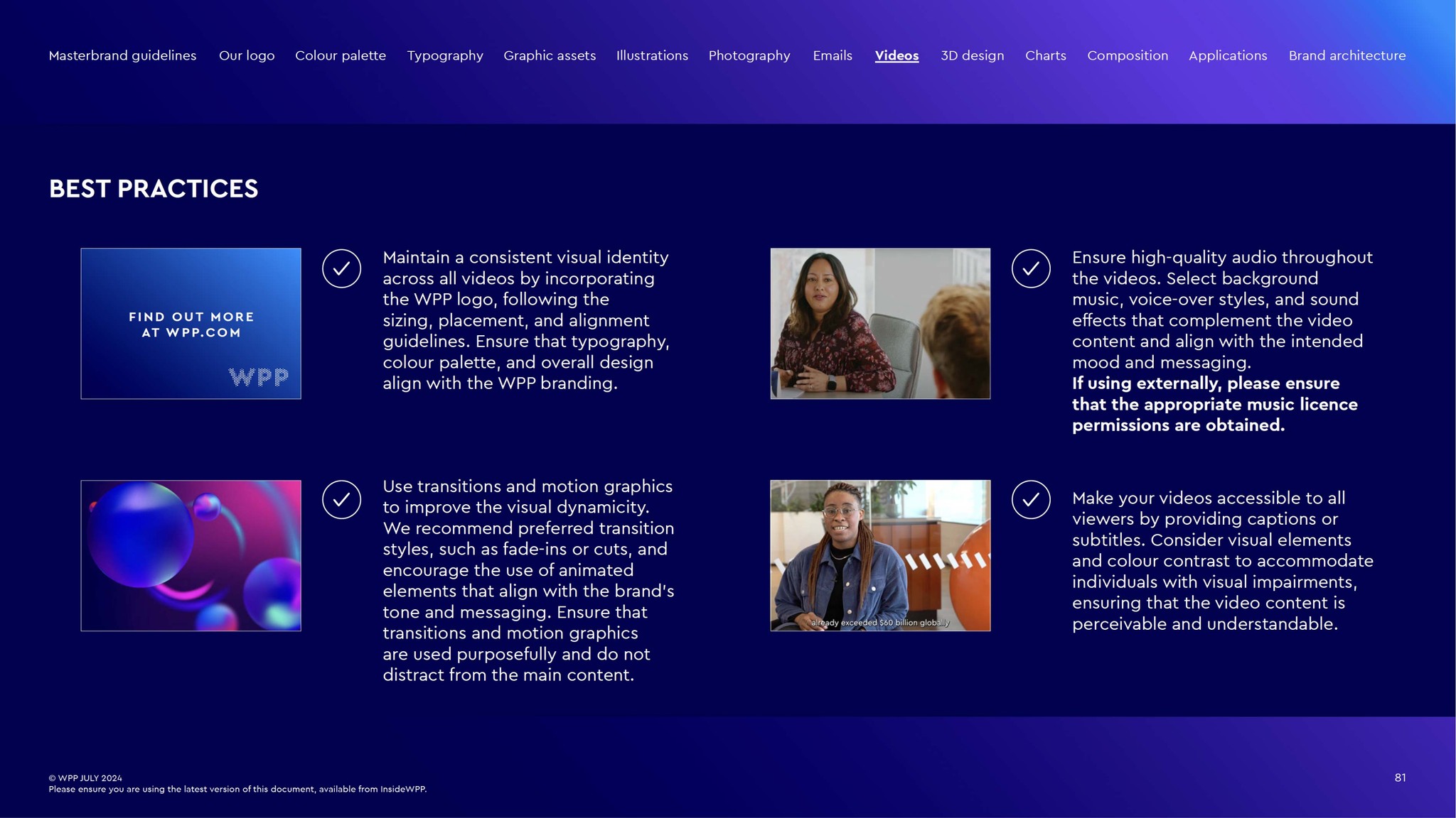
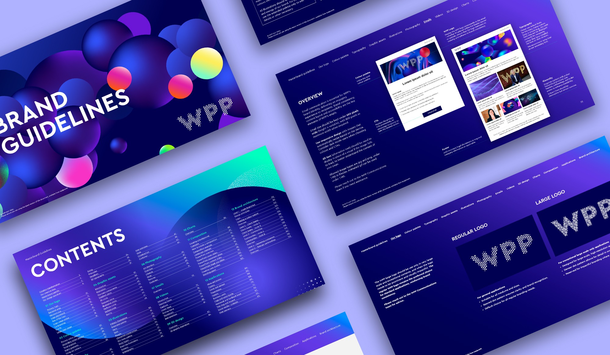
To ensure WPP’s new identity was adopted successfully, I expanded the foundational guidelines into a clear, accessible system. These guidelines cover logo usage, typography and accessibility, helping teams apply the brand consistently across all platforms.
I also led global workshops to support the rollout, equipping teams with the tools and knowledge to confidently represent WPP worldwide.
A comprehensive set of guidelines designed to ensure consistency, clarity and creativity across WPP’s global platforms.
Design approach
We focus on adaptability and clarity, ensuring the brand to shine across diverse applications and regions. Every element, from digital interfaces to physical branding, is crafted to support WPP’s mission of creative transformation.
This approach ensures that our identity feels cohesive and recognisable, while remaining flexible enough to suit varied cultural and regional contexts.
Outcome and impact
The evolution of WPP’s identity has established it as a unified, innovative force in the global market. Key outcomes include:
Global adoption: unified branding across 100+ markets, ensuring consistency and flexibility for local teams.
Scalable design systems: streamlined tools saved time and resources for teams, improving efficiency.
Enhanced digital presence: strengthened engagement across digital platforms through accessible, user-focused designs.
Empowered teams: workshops and guidelines enabled widespread understanding and adoption of the new identity.
This transformation has positioned WPP as a leader in branding and creative innovation, with a cohesive identity that supports its mission on every platform.