WPP
Client
UI/UX Design
Services
2022
Year
This project aimed to elevate WPP’s online presence, creating a digital experience that reflects WPP’s brand identity and values.
We focused on improving usability, meeting accessibility standards and reducing the website’s carbon footprint, while also increasing visibility for WPP’s agencies and their work.
Key challenges
The existing site was difficult to navigate, visually overwhelming and inaccessible. Full-bleed images hindered readability and the content layout failed to highlight WPP’s agencies effectively.
Feedback revealed the website no longer aligned with WPP’s refreshed brand identity, emphasising the need for better usability, accessibility and sustainability. Enhancing the visibility of WPP’s agencies and their work also emerged as a central priority.


Research and insights
Through user feedback and competitor analysis, we identified three key areas for improvement:
Simplified navigation: intuitive structures that guide users seamlessly through the site.
Accessibility features: high-contrast text, alt text, and compliance with WCAG 2.1 standards.
Optimised content layout: modular designs to improve engagement and visibility.
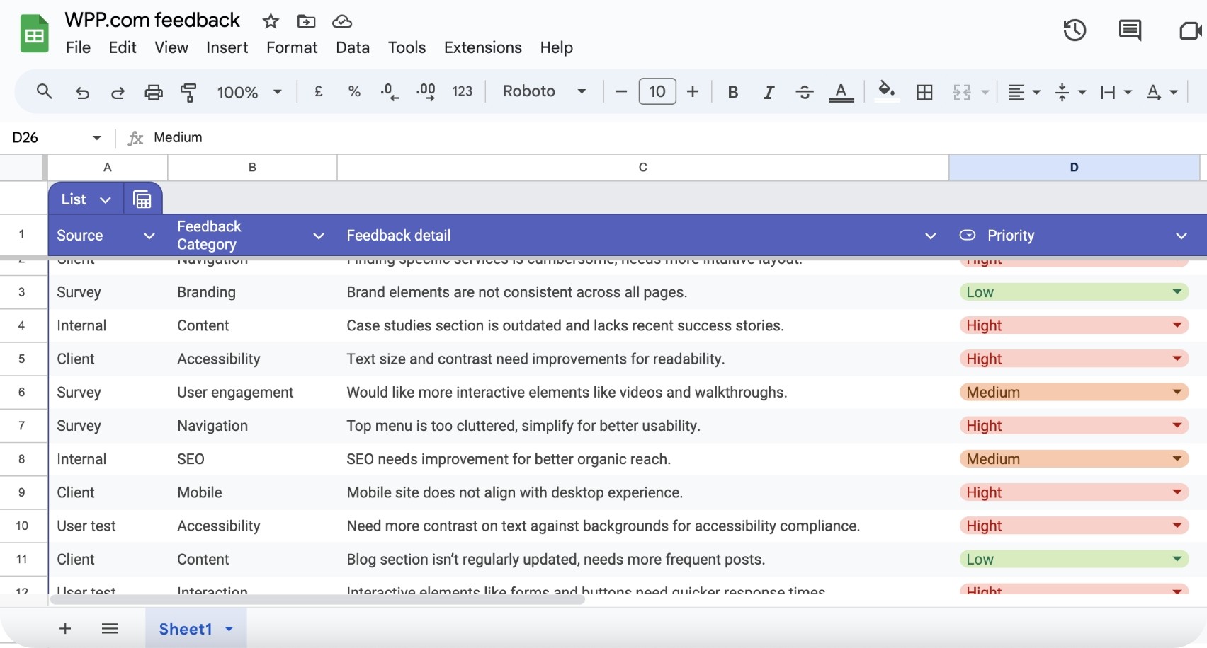
Stakeholder feedback was systematically collected and organised for analysis.
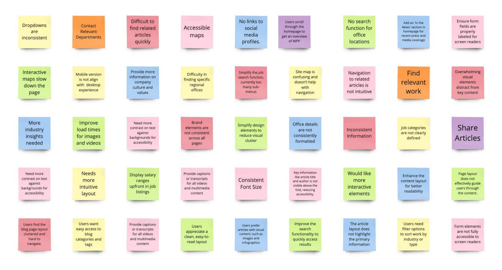
Feedback was visualised using Miro to group similar comments, making it easier to spot patterns and recurring themes
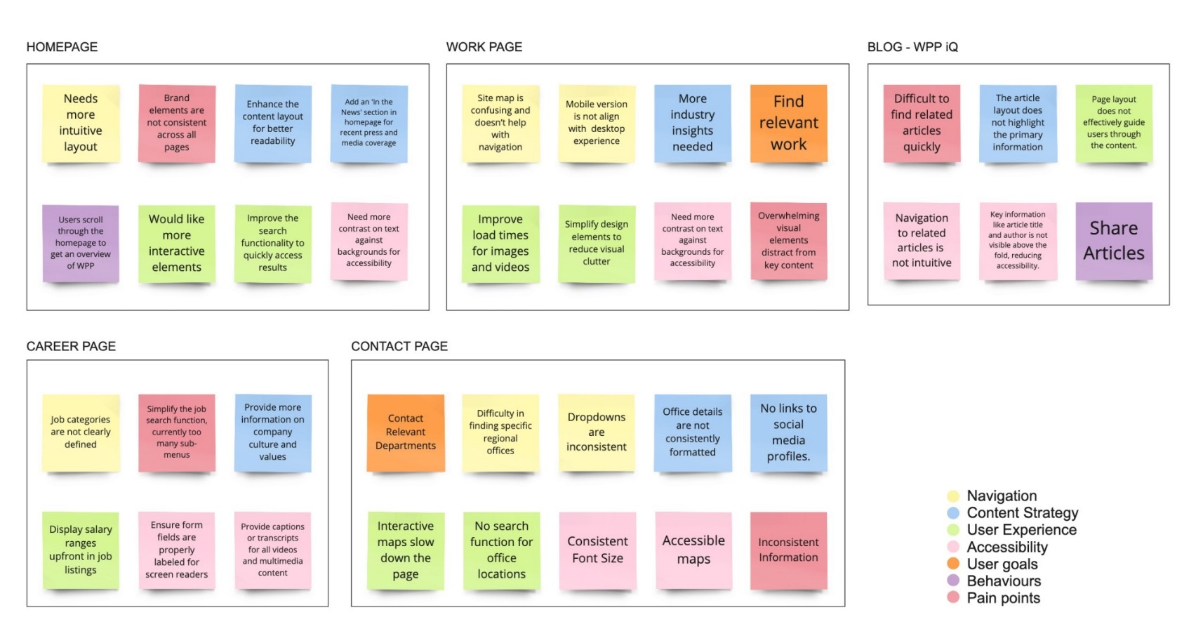
This approach highlighted key focus areas—such as navigation, content strategy, and accessibility—to prioritise user-centred improvements.

To further identify improvement areas, I analysed the corporate websites of leading competitors, focusing on navigation, content strategy, user experience, accessibility, and brand integration. This benchmarking revealed best practices that informed WPP’s redesign strategy.
Design approach

Early wireframes and prototypes explored modular layouts and card-based structures, improving clarity and usability across devices. I led the design exploration, creating wireframes and prototypes to align WPP’s visual language with user-centred functionality.
Key improvements included:
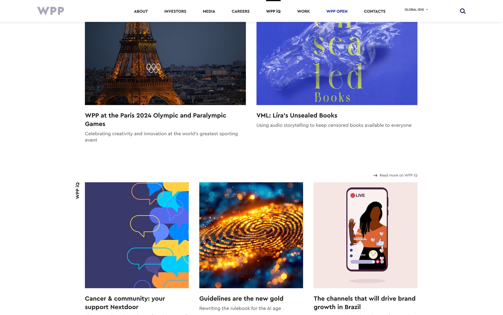
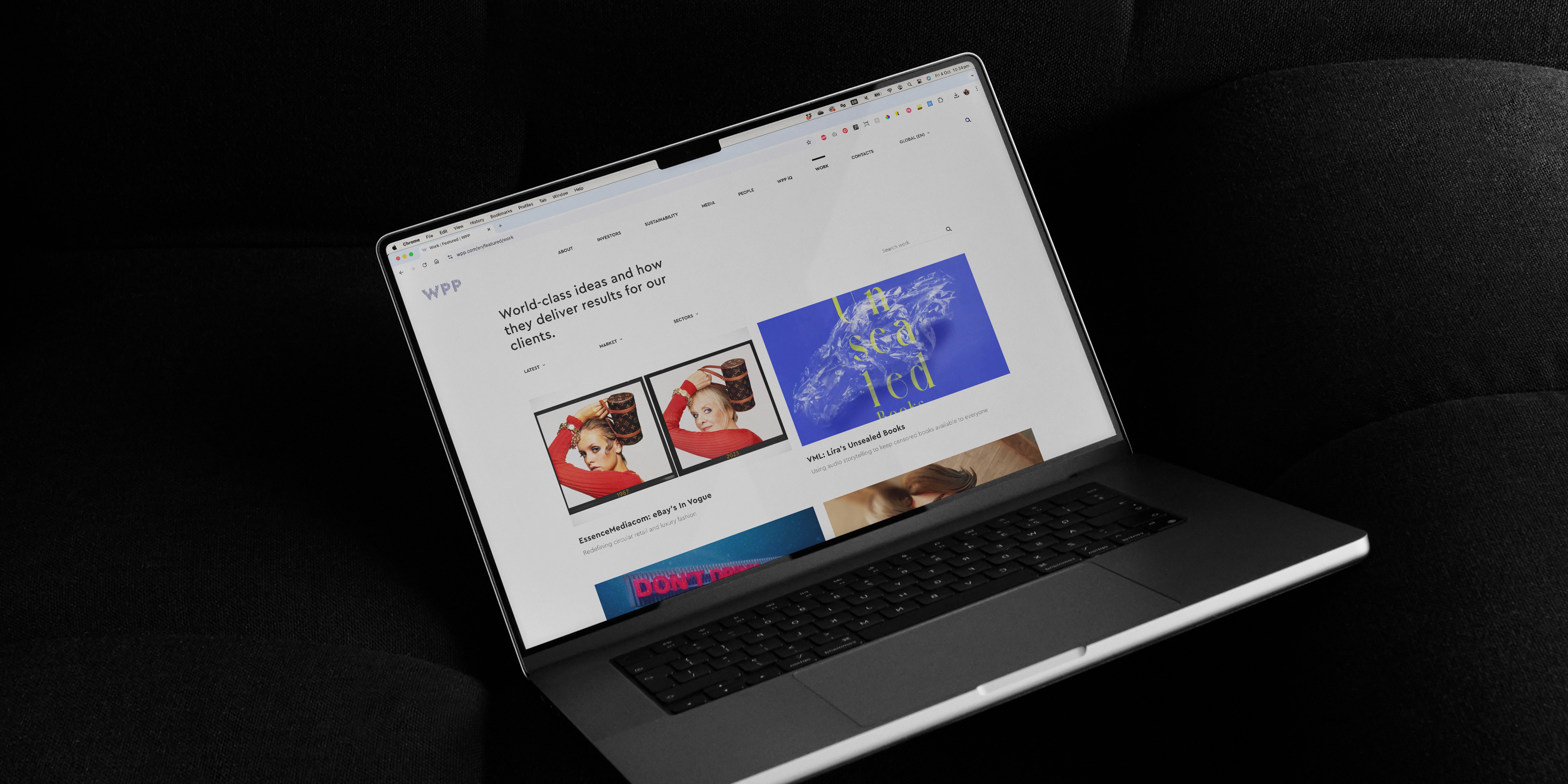
Optimised content layouts: modular designs improved readability and engagement across key sections like "Work" and "WPP iQ" blog.
Content discoverability was reimagined through strategic links, cross-references, and an updated Companies page, now allowing users to explore all agencies across WPP’s network. Enhancements like tags in the iQ section also improved navigation and engagement with thought leadership.
Accessibility compliance: integrated WCAG 2.1 standards, ensuring inclusivity for diverse audiences.
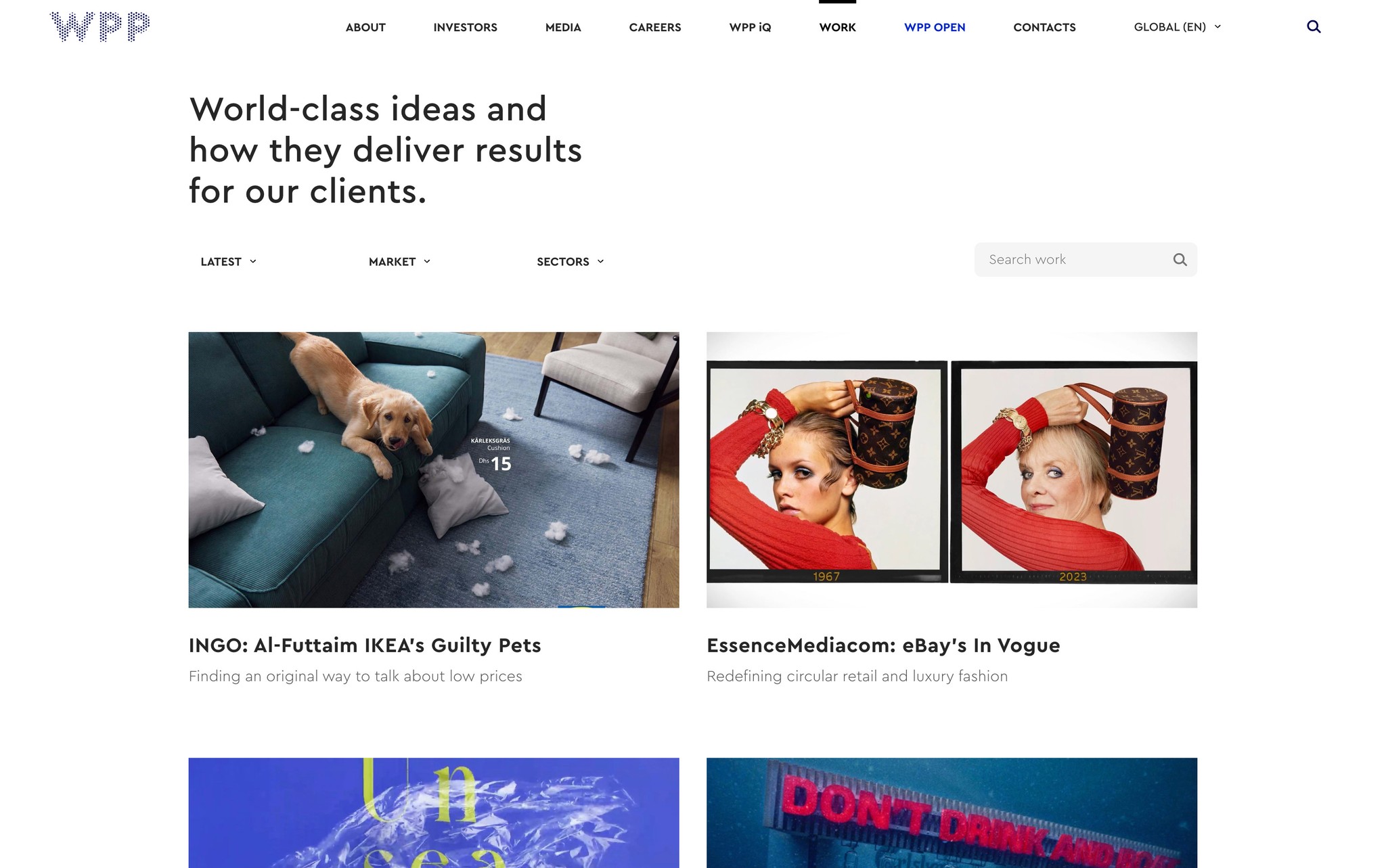
The redesigned Work page replaces a cluttered full-bleed image layout with a clean, modular card structure, enhancing clarity, engagement and navigation.
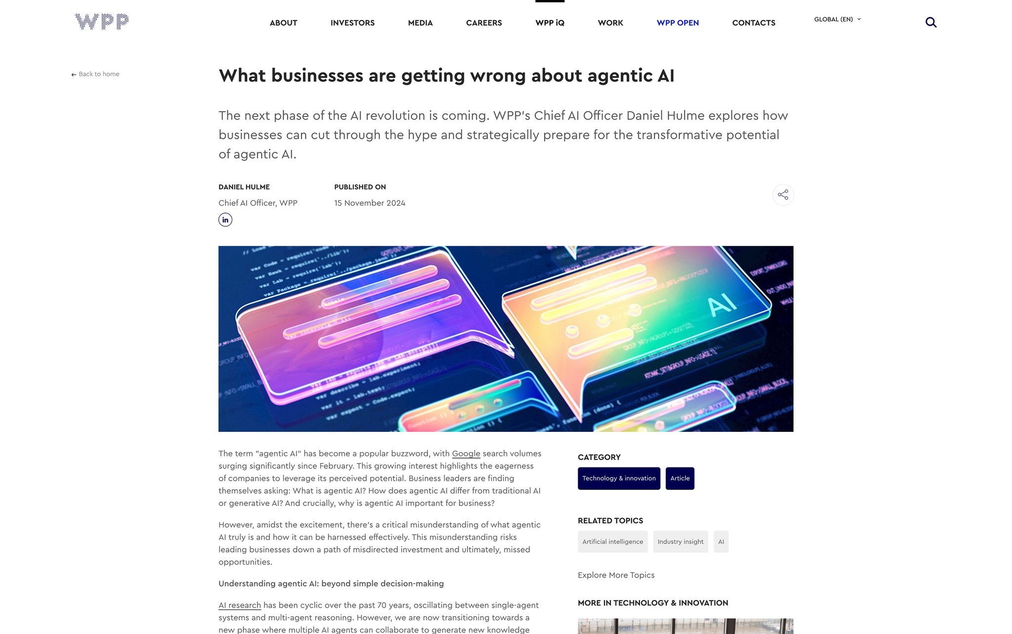
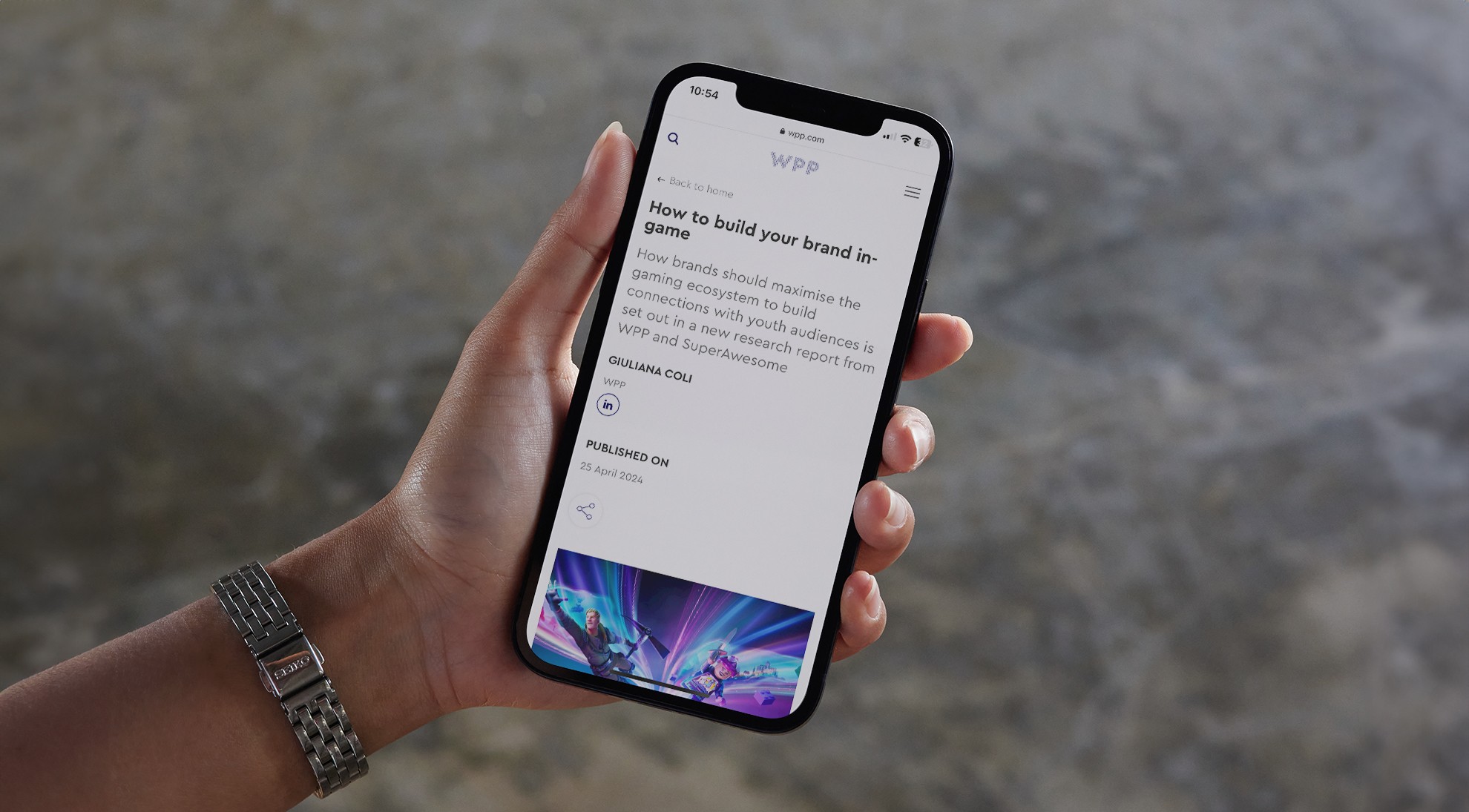
The iQ articles redesign moves key details into the fold for better readability, while adding tags to enhance discoverability.
The redesigned layout replaced inaccessible text on images with a modular card design, improving readability and aligning with WCAG 2.1 standards for accessibility.
Design integration
I've collaborated with developers and content teams to ensure the design translated seamlessly into a responsive, high-performing and user-centred digital experience. Key steps included:
UI Kit development: created a flexible UI kit to ensure visual consistency and reduce design iteration time by 30%, providing teams with reusable components for future updates.
Cross-team collaboration: facilitated alignment between design, development and content workflows, ensuring every detail met WPP’s standards.
Quality assurance: conducted iterative testing using tools like WAVE alongside manual checks for usability, flexibility, and accessibility. This process refined interactions, ensuring full WCAG 2.1 compliance and achieving 0 accessibility errors in automated and manual tests.
Developed a flexible UI kit to ensure visual consistency across WPP’s site, enabling cohesive updates and a unified brand experience.
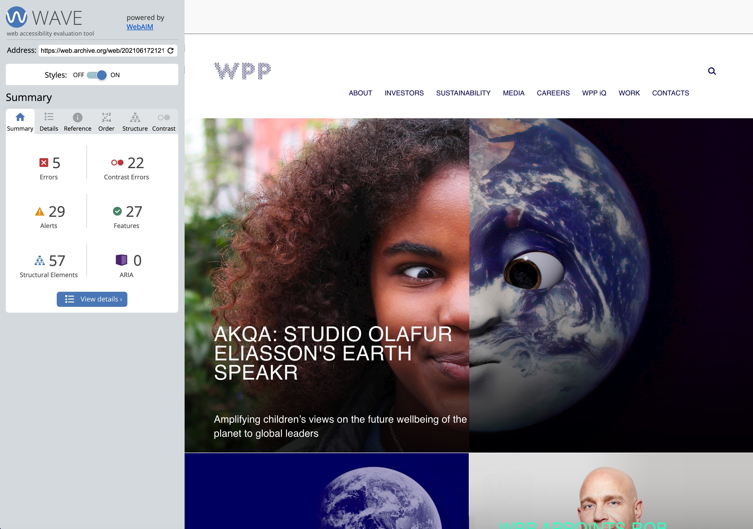
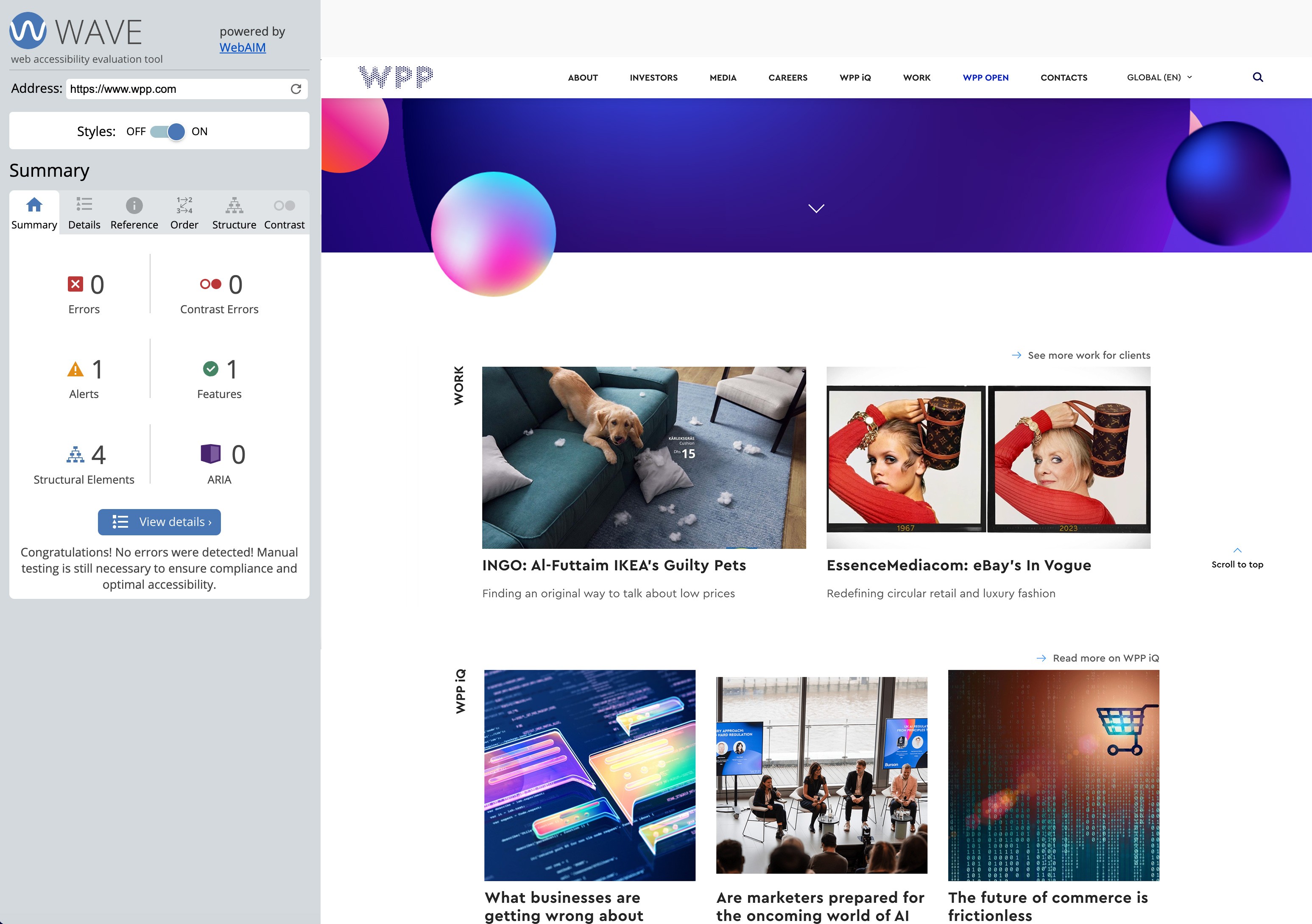
Accessibility testing revealed significant issues in the original site, including errors, contrast problems, and structural flaws. Through iterative testing—including tools like WAVE—we achieved 0 errors and full WCAG compliance, ensuring a seamless and inclusive user experience.
Title
This collaborative process ensured the design not only met immediate project goals but also provided a scalable framework for future campaigns and enhancements.
Outcome and impact
The redesigned website establishes WPP as a leader in innovation, creativity, and inclusivity:
Increased discoverability: strategic navigation updates, made it easier for users to explore WPP’s global agencies network, insights and resources.
Enhanced engagement: modular layouts and dynamic modules improved usability, making content-heavy pages more intuitive and engaging for users.
Sustainability: performance optimisation focused on reducing the site’s carbon footprint, aligning with WPP’s commitment to environmental responsibility.
Focused on usability and engagement, the new site has been met with positive feedback, highlighting WPP’s commitment to innovation and inclusivity.

